

Wednesday, 18 December 2013
Tuesday, 17 December 2013
Spray Images


Here are my 2 sprays of a Marilyn Monroe image. I edited the first image in Photoshop and changed the threshold to get 2 different tones of the image, the one with the most white (top image) and most black (2nd image). I then cut out the black parts of these images and sprayed them, and got these images.

I then got this text in photoshop and cut it out and sprayed it, so i could get the desired effect for my final image.


Monday, 16 December 2013
Finished Spray Paint

Tuesday, 10 December 2013
2nd Parody Image

Saturday, 7 December 2013
Parodies
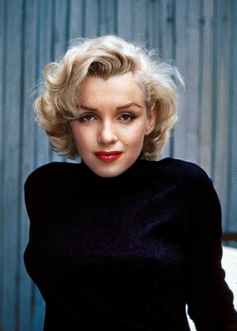

Here are the 2 original images that i chose to use for my parody. The famous piece of artwork I chose was "Adele Bloch-Bauer I" by Gustav Klimt which was painted in 1907, and the image I chose is one of Marilyn Monroe, taken in 1953.

Wednesday, 27 November 2013
Tuesday, 26 November 2013
Magazine Name Ideas

Here is an image of my mind-map of ideas for my fashion magazine. The name I decided to use for my magazine is Vanity.
Wednesday, 13 November 2013


Typeface Exercise


Tuesday, 12 November 2013

Sunday, 10 November 2013
NME magazine working progress shots


Wednesday, 9 October 2013
Finished Camera Manual


Here is my finished Camera Manual. I have taken many pictures, and then put them into photoshop and edited them, so that they look more interesting and attractive.
Wednesday, 25 September 2013
Working Progress Shots for Camera Manual


Thursday, 19 September 2013
Camera Drawings for Camera Manual


Tuesday, 17 September 2013


Friday, 13 September 2013
Working Progress Shot for Business Cards

This is a screenshot for my business cards, it shows all 8 business cards in the template.
Tuesday, 10 September 2013
Business Card Designs

These are my two designs for a business card. They will both be very bright in colour, so that they attract lots of people and certain types of audiences.
Subscribe to:
Comments (Atom)